EXPLORE THE BRIEF HISTORY OF ST. LOUIS TYPE FOUNDING THROUGH CAST AND RECAST, a St. Louis type design exhibition. The type designers who made their mark in history combined innovation, advertising and design during a period of growth in St. Louis.
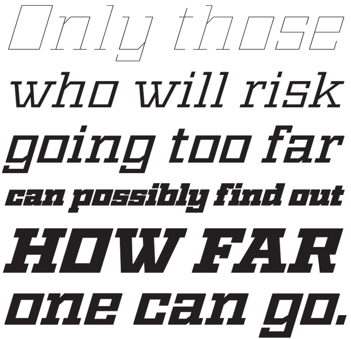
For this exhibition, Ben Kiel created a revival of the typeface Geometric Italic and area designers used the new face to create 23 political poster specimens.
ST. LOUIS TYPE FOUNDING
A BREIF HISTORY
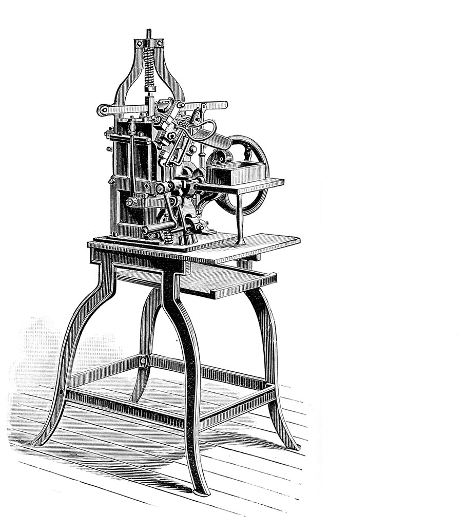
Before 1838, a good type founder could hand cast 3,000 characters in a 12-hour day. Each piece then required individual hand finishing. It could take many days to produce enough type for one newspaper publisher.
1838
David Bruce invents the type casting machine which replaces tedious handcasting. St. Louis gets a casting machine in 1850, and St. Louisan James Pavyer makes fourteen copies of it for St. Louis Type Foundry, speeding up type casting production.
1840
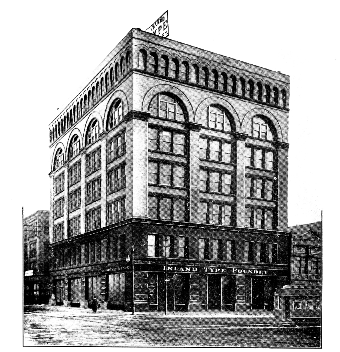
George Charles and Augustus Ladew open St. Louis Type Foundry at 63 Market St. For 52 years, St. Louis Type Foundry produces lead type for western printers from designs made by eastern type foundries.
1874
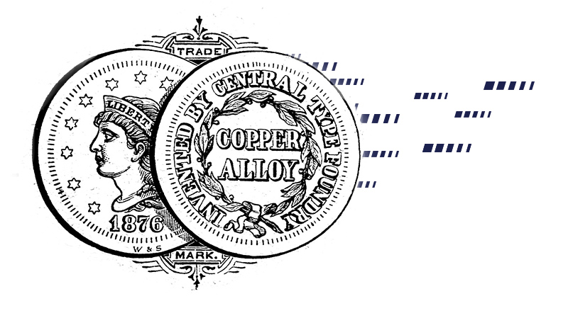
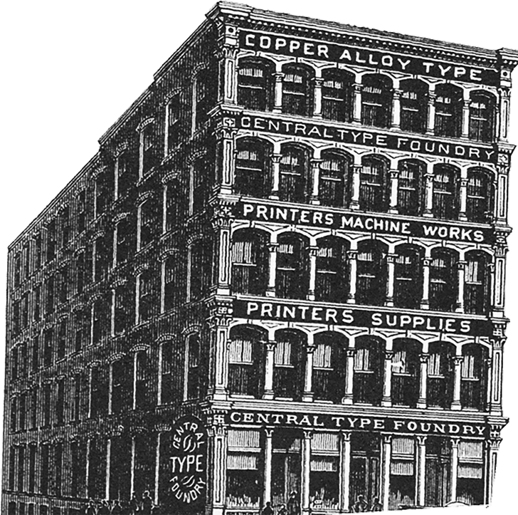
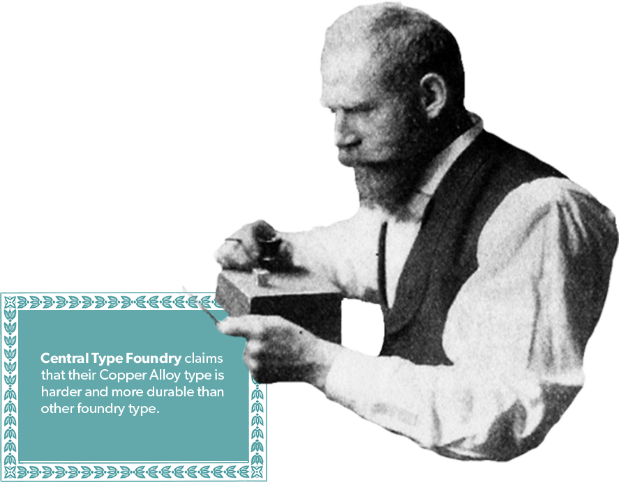
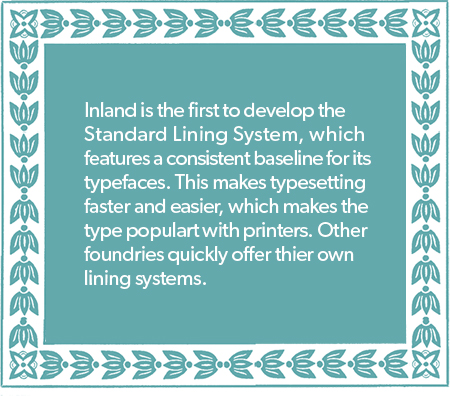
Carl Schraubstadter and James St. John purchase the St. Louis branch of Boston Type Foundry and it becomes Central Type Foundry. Central claims that their Copper Alloy type is harder and more durable than other foundry type.
1878
Central introduces their very first typeface:
Sectional Gothic.
1881
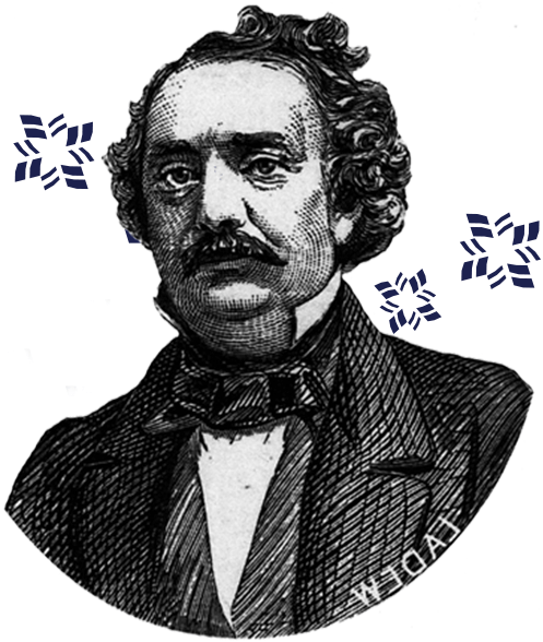
Gustav Schroeder, an engraver, is persuaded by Schraubstadter to immigrate to St. Louis from Germany and comes to work for Central Type Foundry.
1882
Nicholas Werner, A Belleville native, joins Central Type in the specimen dept. and later designs type for Central.
1883
Gustav Schroeder and William Jackson cut Geometric, Geometric Condensed, and Geometric Gothic. Geometric Italic is both designed and cut by Schroeder.
1884
Art Gothic is Schroeder’s first type design, which quickly finds widespread use in the advertising world. Art Gothic is still available and in use in twenty-first century digital form. Digitized by Brian Sooy as URW Art Gothic in 1995, it was also used for title credits for the 1980s detective series Murder, She Wrote starring Angela Lansbury.

1885
Schroeder cuts Atlanta at the suggestion from A.V. Haight. Atlanta is an example of early lining types and becomes very popular for advertisers. Victoria is designed and cut by Schroeder, and serves as narrow version of Atlanta.
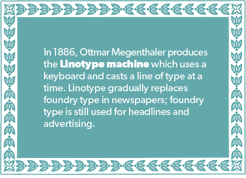
1886
Schroeder designs Old Style Bold.
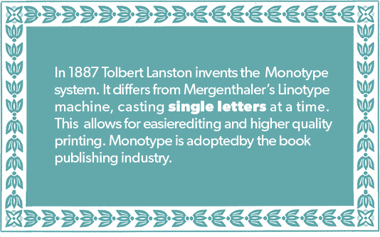
1890
Schroeder designs and cuts DeVinne, and its success marks the move away from decorative typefaces used for advertising to a more classical look.
1892
St. Louis Type Foundry and Central Type Foundry sell out to American Type Founders (ATF).

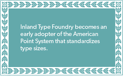
1894
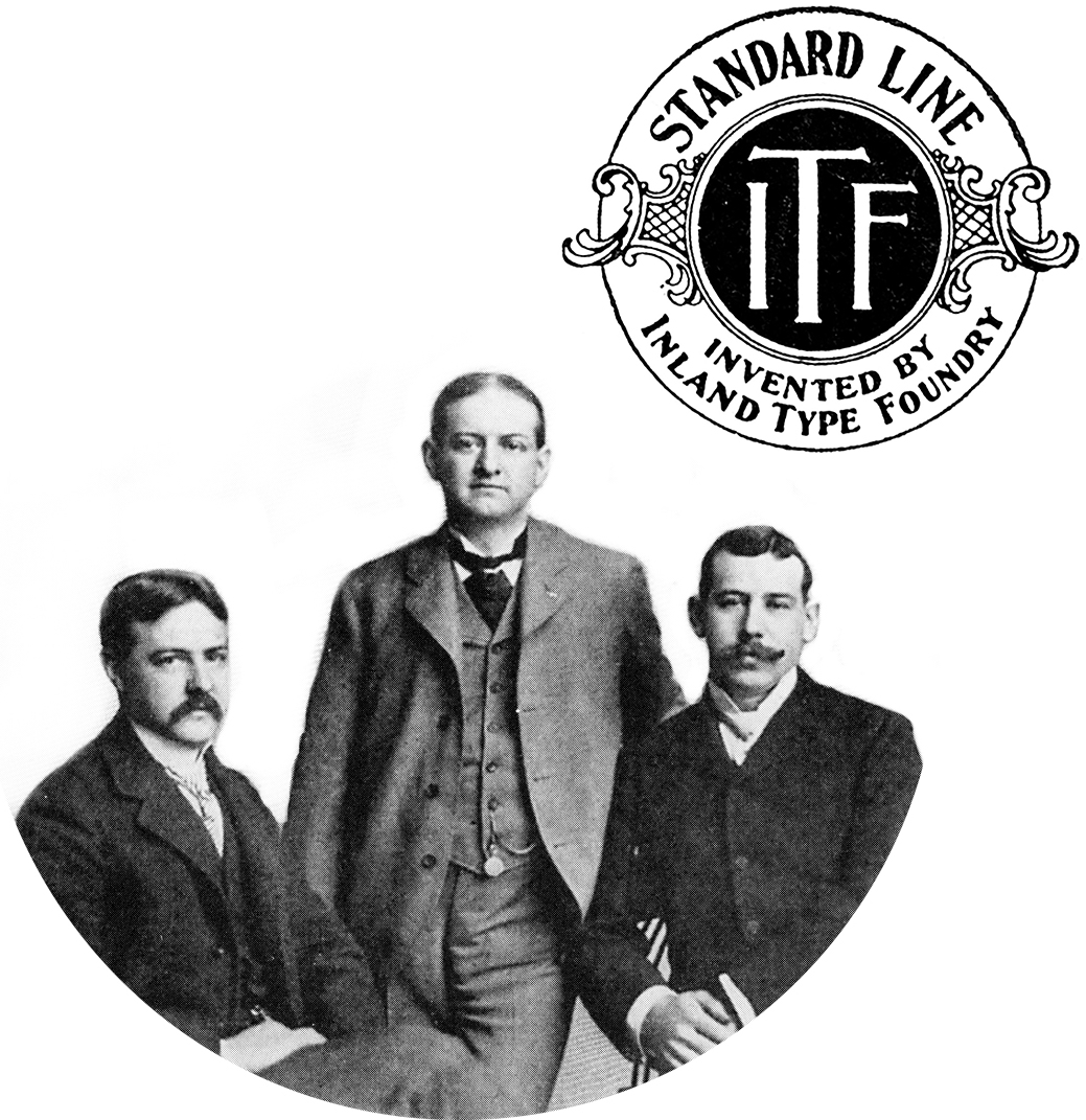
Three of Carl Schraubstadter’s sons, William, Oswald and Carl create Inland Type Foundry to compete with the ATF conglomerate.
1894
William Schraubstadter designs Woodward and Nicolas Werner cuts it.


1895
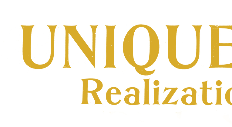
1895 is a big year for type design in St. Louis. Inland is designed by Werner or Carl Schraubstadter, who applies for the patent. Some characters are the same as Edwards. William Schradbstadters designs St. John and Royal Italic. Inland offers Corbitt.
1898
Werner designs and cuts Gothic #8 in response to demand for simpler more graphic faces.
1899
Inland produces MacFarland, which is also called Crawford (Hansen Type Foundry) and Bradford (A.D. Farmer and Sons Typefounding).

1990
Popular with printers, Inland Type Foundry designs Blair.
1905
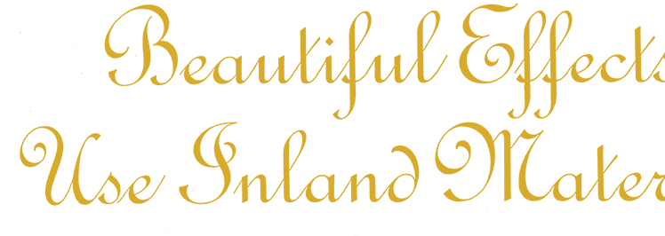
Inland’s elegant French Script is popular with printers.

1906
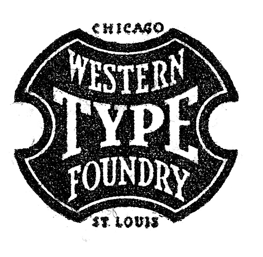
Charles Schokmiller partners with Western Printer’s Supply of Chicago to open Western Type Foundry. Western competes with ATF and produces copies of sucessful ATF typefaces. In 1918, after only 8 years of operation, Wester Type Foundry closes its doors.
1910
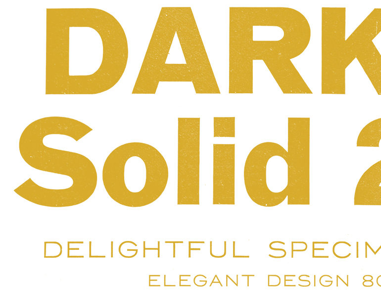
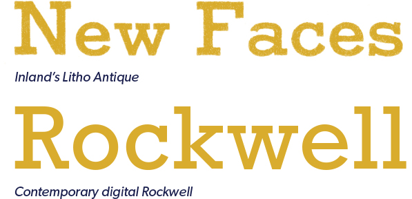
Schraubstadter designs Litho Antique; it is reissued in 1931 as Rockwell Antique. Rockwell is still available and in use in twenty-first century digital form.

1911
Inland Type Foundry is sold to ATF and closes its doors.


1998
Robert Magill opens Monumental Press and later begins casting new lead type on a Thompson Monotype Machine for letterpress artists and small presses. This small foundry is still open and running in Union, Missouri. To watch Magill’s interview, click here.
2004
Schuyler Shipley opens Skyline Type Foundry and casts type for letterpress printers in nearby Calhoun County, Illinois until moving to Prescott, Arizona in 2011. Skyline still casts new type on Thompson Monotype machines for letterpress artists and small presses. Among its offerings are Pen Print Bold by Inland Type Foundry and Grimaldi by Central Type Foundry. To watch Shipley’s interview, click here.

2013
Ben Kiel opens Typefounding, a digital type foundry. Ben designs typefaces using Robofont and other digital font making software.
2016
Ben Kiel designs a digital revival of Geometric Italic for Cast and Recast. Geometric series may have been an early test typeface for a new invention: the pantograph. Its square form is reminiscent of later De Stijl typefaces by Theo Van Doesburg, and can also be compared to 1990’s era Lo Res typefaces designed for the screen by Emigre Type Foundry. To see Ben Kiel’s Geometric Italics in use, go to our Specimen Page.