Living in St. Louis is like living in a pleasant time warp: the 1880’s are just below the surface. So much of this city harkens back to the turn of the last century, when our reputation was notable, our time as a fearless and virile industrial giant. Our libraries are full of books from prior centuries, and we live in majestic stone structures built during this period. We drive absentmindedly past Louis Sullivan’s Wainwright building and the lovely edifices of O. Winston Link.
When I first saw Gustave Schroeder’s typefaces designed for Central Type Foundry, I heard the crank of an old music box playing a waltz, and imagined the sweeping dresses of ladies briskly walking the World’s Fair grounds. There is something palpably right and familiar about these faces. I would almost say that I recognize them, as if these faces were the faces of fellow St. Louisans dwelling in our big-small-town, producing in me a familiar tug.
I love these typefaces. I love their old, lofty, and decidedly out-of-fashion grandeur. They are the lovely dinosaurs, the pre-modern roots that have always made me such a fan of post-modernism. They re-frame the quaint, pre-modern, local. Their naively exuberant frills are my favorite moments.


But Central and Inland Type Foundries aren't just dust from the past, they are the stories of design entrepreneurs. They put me in mind of what kind of opportunities St. Louis designers are particularly qualified to seize, what outposts we are watching now, or could be watching, to make our next move.
Central and Inland’s place in the renaissance of type design reminds me of the type renaissance at the birth of the digital age led by such companies as Émigré Type Foundry. California desgers-come-type-founders, much like early St. Louis printers and punch cutters, entered into type founding because of a rapid growth in technology. St. Louis type founders were frontiersmen, forging into the publishing world at precisely the moment of opportunity: when supply could not yet meet a new voracious demand.
For both typographic revolutions, it was those creative thinkers who were intimate with new technology, type founders in the western outposts of their civilized nations who made a mark on their new industrial type revolutions. They were isolated, in need of expedient solutions for new design environments, and turned to art to creatively solve problems.
It’s also interesting in each case that specimens—catalogs to exhibit and sell type—became organs for new ideas, design growth, education, communication and collaboration. Nicholas Werner’s articles for the Inland Printer and other national magazines for the printing industry were an outpouring of his love for his craft. They also served as excellent guerrilla marketing for Central and Inland. His supervision of the specimen books department for Central and Inland Type, and his influence on the Printer’s Register, Central’s organ, remind me of many of today’s design blogs, that both educate and self-promote. Rudy VanderLans and Zuzanna Licko’s influence on the digital type revolution through Emigre magazine echoes this combination of typeface sales and articulation of the country’s design zeitgeist through specimens that educate.
Some questions I have been asking myself while working on this exhibition are: why is it interesting to talk about St. Louis type design history today? What lessons or possibilities does it offer St. Louis and St. Louisans in our current work environs? Ben Kiel captures an answer in his following essay when he unpacks the word revival. The power of revival is reaching into history at a strategic moment for answers. Ben’s revival of Geometric Italic does just that. This new face pays homage to Gustav Schroeder’s original work and notes how Schroeder made a perfect typeface for his day; one that carries the marks of the machines that made it. Ben’s revival is a call and response to the original, re-framing this first face for modern eyes and modern screens. He designed his type family in Robofont software, our new foundry technology. In the exhibition space, it pleased me to watch the video of Ben designing Geometric Italic in one corner of the gallery while listening to the video of Robert Magill (Monumental Type Foundry) casting type and answering my questions from the other corner of the space. Past conversing with present times.
In the 1880’s St. Louis had a unique opportunity. We were a strategic outpost for innovation in the printing industry and an important rail and river hub. St. Louis started the first newspaper west of the Mississippi in 1808, and for years after, the city was an important artery for the publishing industry, supplying printing equipment, paper and foundry type to printers and newspapers much closer than the East Coast or Europe. St. Louis participated in the birth of the profession later known as Advertising and Design by creating typefaces to delight and decorate the page. They made these for new businessmen who realized the impact of design on the bottom line.
Central and Inland Type Foundries entered the scene with timely business ideas. They made novel faces for an insatiable reading public and ambitious new companies west and south of St. Louis. They embraced technology and argued for efficiency and usability in their products and became nationally competitive by the 1880s.
We seem to be at just such a moment again: one where technology has made St. Louis a city of promise and opportunity. In a January 2016 article in Business Insider, St. Louis was listed as the number one fastest growing city for tech startups, with 342.7 percent deal growth (deals that have the ability to transform local economies) in 2015. Every Thursday in St. Louis Venture Café hosts events attended regularly by 500 innovative young entrepreneurs at CIC, the largest recurring gathering of its kind. It is hosted at one of the St. Louis’ shared working spaces located in the city’s new business corridor in the Central West End. Once again it seems that St. Louis’ location and cost of living presents entrepreneurs with a unique opportunity for innovation. Technology and creativity are coalescing and our city has the opportunity to grow.


When Terry Suhre, Ben Kiel and I first thought about this exhibition, we felt it was important to introduce St. Louis’ type design’s entrepreneurs and tell the story of how Central and Inland Type Foundries combined innovation, advertising and design to make their mark in national history. We thought it was important to have St. Louis type historian Robert Mullen’s voice in this project and we are pleased to have his essay in this catalogue and specimens from his press, Xanadu Press, in the exhibition. The time line resulted from conversations between Robert and myself and was translated into an interactive timeline by Mio Yoshigiwa and Laura Heidotten for the website.
It was also important to create a sense of the typographic environment during this period of growth. To this end, I visited the Missouri History Museum and looked through its fascinating collection of broadsides and specimens. We included reproductions of several of these in the exhibit. We were thrilled to display original Central and Inland specimens loaned from the St. Louis Public Library, where Nicholas Werner’s personal collection is housed.
In counterpoint to the history, we planned to include a new St. Louis typeface. Ben Kiel’s Geometric Italic typeface is a revival of an 1883 Central typeface. Ben created it for this exhibition. We also wanted to allow opportunities for St. Louis designers to collaborate, meditate and actively explore this history. We released advanced copies of the Geometric Italic family to twenty- three St. Louis designers and asked them to create socially conscious type specimen posters. They produced a thoughtful set of silk-screened, digital and letter-pressed posters, each with a unique take on the spirit of this place and this moment in time.
The specifics of type founding seemed complex and difficult to understand, so we included a table about type design process in the exhibition. But nothing clarifies the process like seeing type being made. While researching the exhibition, I became acquainted with Robert Magill of Monumental Type Foundry, who invited me to visit him and witness his Thompson Monotype Linecaster making type. While there, I also got to see and understand how his Linotype machine works. I witnessed first-hand how this printing innovation sped up the typesetting process. Videos of these interviews, as well as specimens from Monumental, Missouri’s last metal type foundry, are also included in the exhibition.
The show would not have been complete without the contributions of Eric Woods of The Firecracker Press. Eric started Firecracker in the early 2000’s and has enthusiastically pursued the history of St. Louis type design for the last fifteen years. He holds the largest collection of type from St. Louis foundries in the city.We are pleased to include chases from his collection with original samples of Devinne and Atlanta, (Central Type Foundry) and Foster and Webb, Corbitt, Brandon and St. John (Inland Type Foundry). These samples could be original samples cast in St. Louis by Inland and Central Type Foundries. It was a pleasure to have this living St. Louis type history included in this show.
Paper. Ink. Press. Type.
These are the four elements that Gutenberg brought together back in the fifteenth century, creating the earliest and most enduring form of mass media: Print. In the intervening five and a half centuries, the technology of printing has changed several times, but the finished product is still the same: letterforms and numerals that document humanity’s ideas, stories, and knowledge reproduced on paper.
At the core of all printing is type, the twenty-six letters of our alphabet that we can read and comprehend. Today, most printing begins on a computer keyboard that sends electronic signals to a digital printer. Yet, only fifty years ago the process Gutenberg developed, the inking of raised metal characters and pressing them onto paper, was still widely practiced. And fifty years before that St. Louis typefounders were still producing new type to ship to printers around the world.
There is a strong heritage of type-making and type design in St. Louis. The city was home to at least eight type foundries between 1840 and 1925, including some of the most prominent companies in the trade. They supplied much of the Midwest, South, and West with their type and printing needs during the middle years of the 19th century, and vigorously competed for business on both coasts and internationally by the 20th century. They supplied publishers with the type they needed for newspapers and periodicals and offered over 200 original type designs to use in advertising.
It all started in the year 1840, when George Charles and Augustus Ladew opened the St. Louis Type Foundry in a small shop at No. 63 Market Street. St. Louis was a bustling city of 16,000 people at the time, its merchants and a few small manufacturers serving the needs of much of the region. Chicago had a population of 4,000 and Kansas City, Houston, and Los Angeles were villages. But the states and territories being supplied by St. Louisans were growing rapidly with new immigrants from the east and from overseas.
Ladew and Charles manufactured type nearly the same way that Gutenberg made type, pouring molten metal into a hand-held mould, casting one letter at a time. A good typefounder could cast 3,000 characters in a 12-hour day. Each piece then required individual hand finishing. It could take many days to produce enough type for one newspaper publisher. The St. Louis Type Foundry cast standard sizes of type used in the body of a publication, and it was a distributor for decorative advertising type made by older type foundries in the east.
The type casting machine, which eventually replaced the tedious process of hand casting, was patented by New Yorker David Bruce in 1838. It did not find its way to the St. Louis Type Foundry until 1850, when the company probably purchased one of these machines. James Pavyer, an experienced type founder and recent immigrant, proceeded to make fourteen copies of it over the next ten years. His machines sped up type production and helped the company to meet the rapidly growing demand for type in the west. For fifty-two years the St. Louis Type Foundry performed a very fine job of providing hundreds of western printers with the type, supplies, and equipment they needed for their businesses. Yet, they may never have produced a new design for a typeface. That job was left for other type foundries.
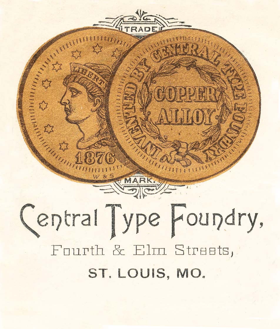
By the 1870s, huge population growth in the city of St. Louis and the western territories brought competition to the St. Louis Type Foundry. The Boston Type Foundry opened a St. Louis a branch of their company in 1871. It was doing a good business and by 1874 its managers, Carl Schraubstadter and James St. John, purchased the business from the Boston company, calling it the Central Type Foundry. With Schraubstadter’s long experience in the craft of typefounding in Germany and America and St. John’s business and marketing acumen, the company would grow to be one of the leading type foundries in the nation. By late 1875 Central claimed to have supplied the type for every newspaper in the city. They also claimed that their type, advertised as “copper-alloy type,” was harder and more durable than other foundries’ type. But Central’s greatest strength in the market would be the ever changing variety of type designs they introduced.
These were the early years of the advertising age. Mechanization made large scale manufacturing of many products possible, and industrial competition for consumer dollars grew intense. Sewing machines, shoes, apparel, furniture, household items, farm machinery, and hundreds of other products required customers, and businessmen began to recognize the power of advertising in newspapers, periodicals, direct mail, and elsewhere. Spending for advertising by American businesses grew from $50 million in 1867 to $500 million by 1900.
The typefounders recognized this shift and began offering many new and modern typefaces for advertising use. In 1876, Central’s house organ Printers’ Register, James St. John stated: “Advertising is becoming so general, and newspaper editors have come to look at it as much an integral part of their business, that probably few even think how recently it is that the receipts from the advertising columns of a newspaper have been considered worth more than ordinary attention.”
Like other decorative arts, type styles changed over time to meet the changing tastes of the public. It was a fortunate era for type foundries that created new type styles. The typefounders took advantage of the Bruce casting machine, which made possible the casting of more intricately designed typefaces. They offered many new designs in the Gothic and Rococo revival styles during the 1850s and 1860s. By the 1870s, the aesthetic movement in the arts created a demand for very decorative advertising, with stylized type, ornamentation, and color. Hundreds of new designs were cast by progressive type foundries across the country. They ranged from scripts to sans serif faces, but most were highly stylized advertising faces. Stretched, condensed, contorted, decorated, and re-imagined letter forms were the standard of the day. The term artistic printer came into popular use, meaning a printer who skillfully combined these new type styles with the artistic taste of the aesthetic movement into his designs. Increasingly, as the end of the century progressed, advertising agencies in larger cities took over much of the design phase from the printer.
The timing was right for the Central Type Foundry to enter this field. It introduced its first original type design in 1878, Sectional Gothic, a type that cast the upper and lower halves of a letter on separate pieces of type, allowing a banner to be printed between them. It was successful enough to encourage the firm to continue with other new designs, and it produced about seventy more before the company was sold to the American Type Founders Company in 1892.
While Central hired a few outsiders to design type, it had two prolific in-house designers, Gustav Schroeder and Nicholas J. Werner. Schroeder had been an engraver in Germany when he was persuaded to come to St. Louis by Central’s manager Carl Schraubstadter about 1881. He had no experience designing typefaces, but learned quickly under the tutelage of his St. Louis mentors. He actually became a trend setter in type design beginning with one of his earliest creations, named Art Gothic. The face had both admirers and detractors, with its irregular forms and hand-drawn look, but quickly found widespread use in the advertising world. Art Gothic is still available and in use in twenty-first century digital form. Other popular types designed by Schroeder included (among others) Atlanta, Old Style Bold, Royal Script, Geometric Italic, Victoria Italic, and the hugely popular and often copied design of DeVinne.
Nicholas Werner was born in nearby Belleville, Illinois, the son of a German immigrant. His talents for type design were developed through his experience as a printer and later as the designer and printer of Central’s type specimen books and much of its advertising. He and Schroeder collaborated on several designs and briefly had an independent type design and engraving partnership. Werner drew and engraved a number of typefaces for Central, including Mid-Gothic, Multiform, and Johnston Gothic.
Both of St. Louis’s type foundries sold out to the national conglomerate, the American Type Founders Co. (ATF), in 1892. Two years later, Carl Schraubstadter’s three sons began the Inland Type Foundry. They had practically grown up in a type foundry, with the older boys Carl, Jr. and William taking on some of the responsibilities from their father at Central in the late 1880s. At the suggestion of Nicholas Werner, Inland engineered its molds and matrices to specifications that no other type foundry had ever used. Advertised as the “Standard Lining System,” every typeface was cast to align to a standard baseline shared with the other types cast by the company. Printers quickly accepted the concept because they no longer had to make time-consuming adjustments when an ad called for a new style or size of type in a single line. Standard lining was so popular that it made Inland a strong competitor to ATF. Within ten years every type foundry in the country offered some form of lining type, including ATF’s American Line.
Inland also offered over a hundred new typefaces during its seventeen years of existence, designed by Nicholas J. Werner, the Schraubstadter brothers, and some by outside contractors. When Inland opened its doors in 1894 the fanciful type designs of the previous decades were being abandoned. The art nouveau movement was in full swing and most new types were less ornate and largely began to return to a more readable classic form. Inland offered the Woodward series, St. John, Royal Italic, and Cosmopolitan, all which could fit into a nicely designed advertisement of the period. By the early twentieth century ornate types were seldom used by advertisers. Inland’s more functional designs of Blair, MacFarland, various gothics, and the elegant French Script were popular with printers.

In 1906 former Central and Inland employee, St. Louisan Charles Schokmiller, partnered with the Western Printers’ Supply Co. of Chicago to form the Western Type Foundry. Schokmiller provided the type making know-how and the St. Louis-based factory while his partners handled the business end. He was a talented mechanic who designed and built type casting machines and knew the typefounding craft thoroughly. Many of the typefaces Western offered were copies of successful designs made by ATF. For example, the popular Cheltenham family was offered in Western’s catalogs as Chesterfield. But the Western Type Foundry also offered several original and extensively used types created by the highly regarded engraver and designer Robert Wiebking of Chicago. The Steelplate Gothic series, for example, was cast by ATF many years after Western shuttered its doors in 1918.
Both Western and Inland provided considerable competition to ATF, and they prominently advertised themselves as not being a part of the “Trust,” appealing to printers who did not like the idea of a type monopoly. Eventually, the reality of a shrinking market for type forced them to be absorbed by the corporate giant ATF. Schokmiller made a second attempt at starting a type foundry in 1921, the Laclede Type Foundry, but this firm also could not compete, selling out in 1925.
The typefounders of St. Louis played a major role in the history of their craft. They supplied a large percentage of printers in the emerging states and territories in the middle of the country with the type, presses, and materials they needed to survive. Before the end of the century their products were being shipped across the continent in every direction and to customers in Europe and Latin America. St. Louis type designers Gustav Schroeder, Nicholas Werner, and the Schraubstadters brought out popular and widely used typefaces in national publications. This is the heritage of St. Louis’s printing history that continues today.
Metal typefounding in the twenty-first century is a niche market kept alive by the current letterpress resurgence. Two typefounders have operated in the St. Louis area in this century: Schuyler Shipley’s Skyline Type Foundry, now of Prescott, Arizona, was run nearby in Illinois until 2011.
At its heart, typeface design is a conversation with history. While this is true for all design disciplines, when designing letterforms, this conversation is most explicit when directly working from historical sources. In the 2003 specimen book for Tribute — designed by Frank Heine and published by Emigre — John Downer writes in his essay “Call It What It Is” that there are many legitimate paths for working with history, but no path will render an exact digital reproduction of a typeface design for metal, the mediums simply are unalike. He continues the discussion by offering a taxonomy of terms for different types of reworked history. In his scheme, the design of Geometric Italic (working title) is a tribute typeface. This apellation seems apt for this celebration of Saint Louis’s contribution to typeface design and manufacture.
Contained in Downer’s observation — that various mediums produce various results — is another truth about typeface design: each system for making marks produces different typefaces. This notion seems simple and obvious, but often escapes notice. The first Latin typeface design, Gutenberg’s Bible type, mimicked scribal blackletter made by a broad-edged pen. Roman capital letters, in contrast, show the influence of both the brush and the chisel. Bodoni took the high contrast marks of the pointed pen and rationalized them. In all these instances, the tool that made the handwritten mark sets up the system for the design of letterforms. Each tool gives the designer a different system to work and play with, but the forms are connected through what marks the tool allows. This calligraphic view of typeface design is best summed up by the work and writing of Gerrit Noordzij, who famously said that typography is “writing with prefabricated letters.”
There are other tools and views on mark making beyond the calligraphic. Until the photo and digital era, type was a physical object. The tool that made these tiny sculptures was the graver. The act of carving is shaping negative space—both the inside and outside of the letterform—by paring away at positive space. While a calligrapher creates negative space by making a mark, the punch cutter defines positive space by physically carving away the negative space. One master of this tension was William Addison Dwiggins, whose designs played with inside and outside contours of a shape in a way that the pen or brush cannot. This sculptural view of typographic design acknowledges type as an object, not just a flat image. The two views are complementary, and the designer chooses how best to negotiate the tension between them.
In current times, however, our typographic tools have moved out of the physical realm and into the digital. Here there is another mark and view to consider: that of the pixel. Our letterforms, however they were designed, are increasingly presented to us on screen, where the pixel takes an ideal representation of the design and gives it presence. With digital typefaces, the designer creates one design to be used at any size the user of the font chooses. Depending on the screen and resolution, the pixel will either be very evident or will recede. Typeface designs such as Emigre’s Lo-Res series (from when screens were very low resolution) or Gustavo Ferreira’s Elementar (from when screens were higher resolution, but inconsistent between platforms) work with the pixel as the primary unit of the design.
This detour into mark making brings us to the design at hand, Central Type Foundry’s Geometric series of typefaces, which were started in 1880 and were designed by Gustave F. Schroeder and cut by William A. Schraubstädter. Geometric fits into the design of display typefaces of the 1880s made especially for the Artistic Printing movement of the day. This represents a segment of the design market that Central Type Foundry deliberately targeted with catalogs such as 1892’s Popular Designs for Artistic Printers. The design is notable for being one of the first, if not the first, typeface to have its matrices cut by machine, an important innovation that Central Type Foundry brought to typecasting. Aspects of this design seem to resonate historically. Geometric resembles the forms of Theo Van Doesburg’s 1917 alphabet, De Stijl, which likely influenced the forms of Emigre’s Oblong typeface from 1988.

The influence of technology is what drew me to Geometric. As Central Type’s first type design cut by their pantographic router, it takes not the notion of a pen, brush, or graver for its rules of construction, but instead the basic movements of the router’s cutting head. I suspect that the line weight is also a reflection of the router, the line weight is simply the width of the router’s cutting bit. The design consists of simple movements and construction, designed both for the typographic tastes of the time and for testing the new machine. Geometric has many parallels to early digital type, both in the forms created and in the approach to working out best practices for making type in a new environment. The typeface starts simply and then builds on knowledge gained as the type family grew. Looking at the design of Geometric Italic with a modern eye, I found a design that felt at home on the screen, made to work well with the unit of the pixel. While, at first, it felt dated for use on the printed page, the design seems like it was tailor-made for use on screen. The simple forms express how design is still grappling with the possibilities of typography when type isn’t fixed in place by printing.
However, for the modern type designer, simply recreating the forms that one finds in a specimen is to give up on imparting something new with the design. Geometric Italic is a tribute to the work of Schroeder and Schraubstädter, but it asks what they may have done with digital tools 136 years after the original design. I brought a calligraphic touch into it, introducing an angled join (at 45 degrees, the easiest angle for a screen to render) where strokes meet stems. This move makes the typeface less stiff, and — to my eye — more modern. Current typeface design allows the designer to quickly explore the range of a type design through interpolation: this exploration gave Geometric Italic a large range of weights. Few graphic designers wish for fewer weights of a design, the right weight has the ability to express an idea or emotion perfectly. This is especially true for the screen, where type can appear heavier in one operating system or browser than another. Weight range allows designers to tailor their work for each context in which it appears.
Working as a typeface designer, each day is spent with black and white shapes. We have our ideas for how we want a typeface design to be used, but that use is outside of our control in the end. Seeing Geometric Italic used in the posters from this exhibit is both gratifying and instructive. I see a multitude of changes to be made to improve the design, but also a delightful range of uses I would never have expected. I want to thank Jen McKnight and Terry Suhre for the opportunity to be involved with the project. They have put together a great showcase of what Saint Louis gave to the history of typecasting and design in America, and I am grateful to have been involved.